
In the solid waste and recycling industry, we hear statistics all the time. The amount of hazardous waste produced each year could fill the Superdome 1500 times. A coal-fired power plant generates 3.4 million metric tons of CO2 each year. Humans cut down 15 billion trees each year.
That’s a lot of information, but what do these statistics actually mean to us?
Unfortunately, not as much as they could. Try to visualize 3 million tons of trash, 30 million tons of trash and 300 million tons of trash. Can you even picture the difference?
For most of us, numbers at this scale are difficult to make sense of. That’s why, when you perform outreach of any kind, statistics often aren’t effective in their raw form. They need to be housed in appropriate, meaningful language. This is where comparisons come in. When you have a statistic that’s important, find a way to compare or equate it to something concrete and easy to visualize.
The tricky part of this is figuring out what is easy to visualize. Because if the comparison is just as obscure as your original statistic, e.g., 1500 Superdomes, it’s not effective. So how can you make comparisons that don’t get lost in the ether? Here are a couple of strategies that will help.
Use Online Tools
The EPA has two great tools for us. The first is the Greenhouse Gas Equivalencies Calculator. This calculator accepts either energy usage data, such as quantities of gasoline or electricity, or emissions data, such as quantities of CO2 and other environmentally harmful gases. Then, it translates the data into a slew of comparisons for you to choose from. It’s great because it can help you hone in on a comparison with a smaller number — one that is easier on the human imagination. We put this tool to use in a blog post about the environmental benefit of recycling your clothes:
If everyone in the U.S. recycled their clothing and textiles for one year instead of throwing them away, it would save 30.6 million metric tons of carbon emissions. That’s the same as taking all the cars in Los Angeles off the road for one year.
We took the statistic from Business Wire — 30.6 million metric tons of CO2 — plugged it into the calculator, and received a ton of information.
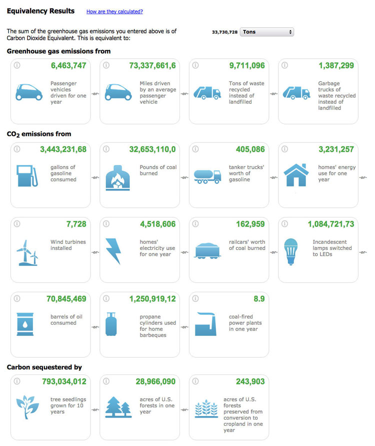
Notably, one of the comparisons the tool offers is 6.4 million passenger vehicles driven for one year. This number isn’t especially useful by itself, but after a little research, we discovered that this is roughly the number of cars currently registered in LA County. Considering the notorious traffic in the City of Angels, we thought this was a perfect way to visualize the positive impact that recycling can have. It’s also a much more relatable comparison than, say, 9 coal-fired power plants.
So don’t feel limited to repeating the exact results you get from this calculator — you can easily translate the numbers one step further. For example, the electricity used by thousands of homes could be translated into the electricity used by all the homes in a well-known city. Or, millions of acres of forest could be translated into the size of a state. The possibilities are endless — just choose one that’s small in number and represents a size or quantity that will be relatable for your audience.
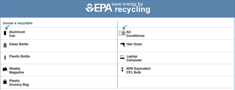
The second tool from the EPA is the iWARM Widget. This tool shows how much energy you can save through recycling. However, instead of showing energy in kilowatt-hours, it shows energy via the length of time you could power various electronic devices.
Let’s say you wanted to highlight how much energy you save by recycling plastic grocery bags. If you recycle 10 bags, how much energy does that save? As it turns out, enough energy to run a computer for 3.9 hours.
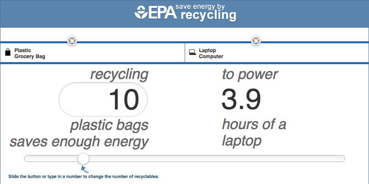
That’s pretty convincing, right? You can either use this tool for your own data purposes, or embed the iWARM Widget into your website, so residents can see for themselves the impact of recycling on energy use.
Use Infographics
If you’re still not jazzed about how great your information might look with the help of these comparison tools, let’s consider another communication tool: infographics. Statistics don’t work when we can’t visualize them, right? Then combine your numbers with images so your audience can actually see them.
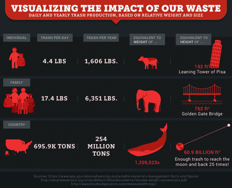
The article “Land of Waste” by Save on Energy uses several infographics to help the reader see the piles of waste growing across the U.S. The table below isn’t quite as fancy as their animated maps, but it does a good job of scaling the amounts of trash from the individual level to the national level, and from a daily level to an annual level. This is highly effective in reinforcing the consequences of an individual’s daily choices.
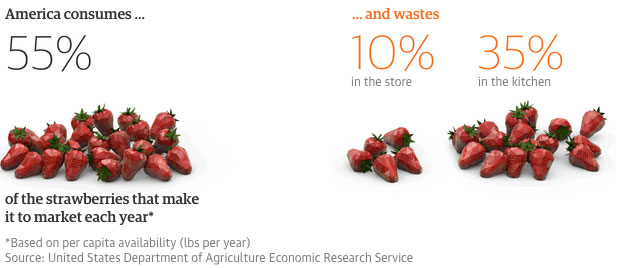
For another, simpler example of effective visual comparisons, check out The Guardian’s article “From Field to Fork: The Six Stages of Wasting Food”. Instead of showing percentages in a chart of some kind, this article shows percentages in small, illustrated piles of a particular type of food — the resource that’s actually at stake.
Want to create your own infographic but not sure where to start? Check out Creative Bloq’s recent roundup of the best tools out there.
Ultimately, the purpose of communicating any kind of statistic is to educate and inspire behavioral and cultural change. Once you have important information, don’t drop the ball and communicate it in scientific jargon or unfathomable quantities. Figure out a way to translate it into something meaningful. Otherwise, you’re not going to convince anyone to play who isn’t already in the game. When you make numbers tangible and personal, you make them relatable — and thus powerful.
For more ideas on motivational messaging, check out our post on Market-Tested Language to Inspire Environmental Action.